Core focus of the website redesign
Overview of IVA
Value proposition and post-program pathways
Program offerings and professional network
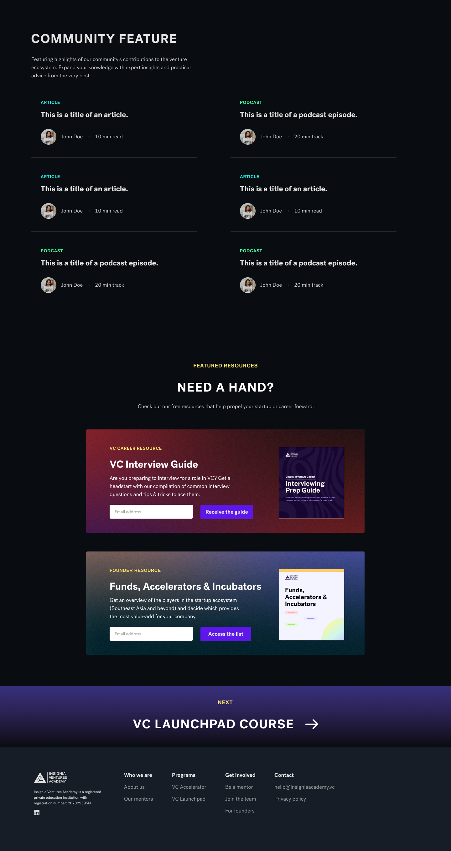
Community feature and free resources
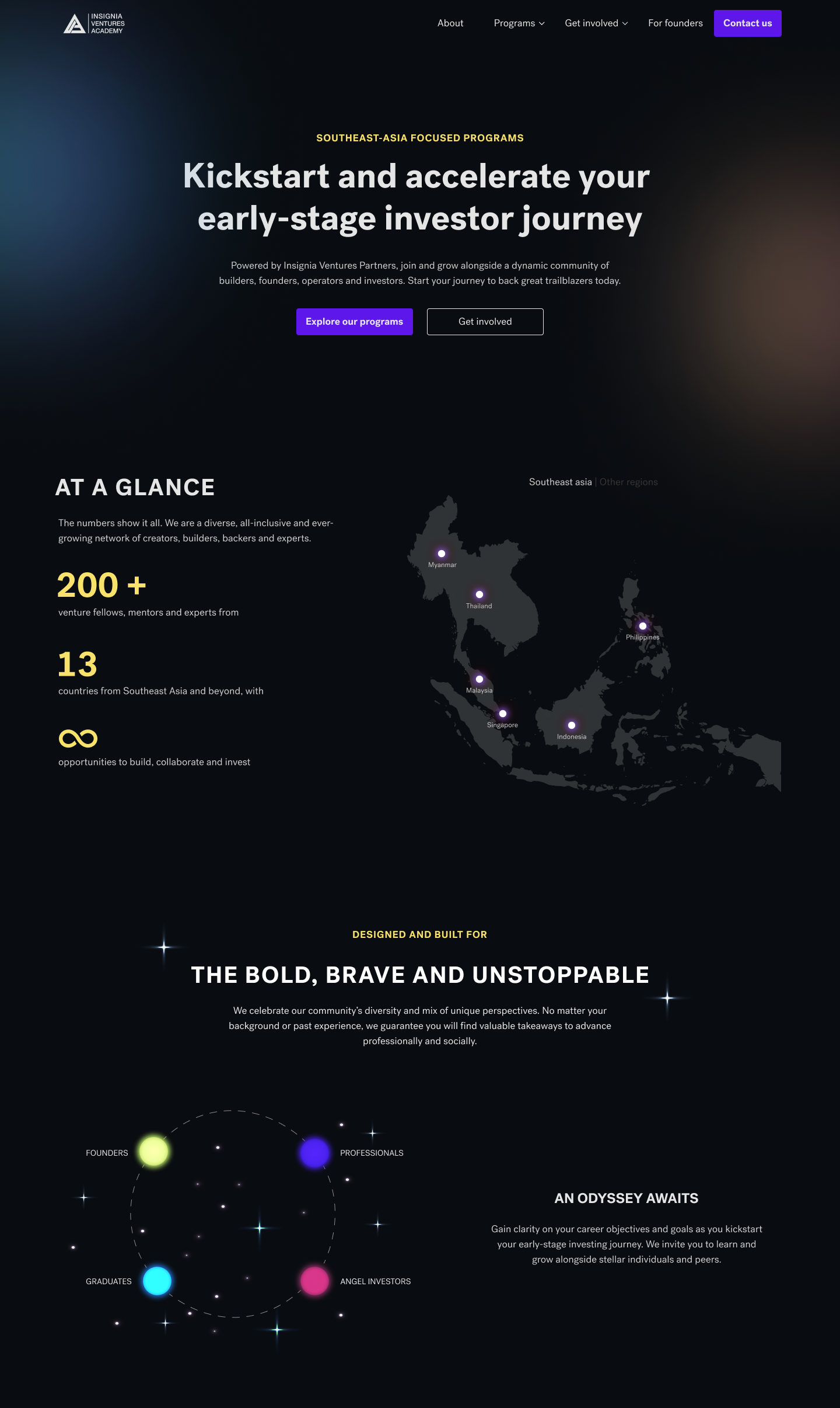
I started the website with a header that succinctly encapsulates the company's value proposition, as well as general statistics to showcase the network of venture fellows and alumni in the region.
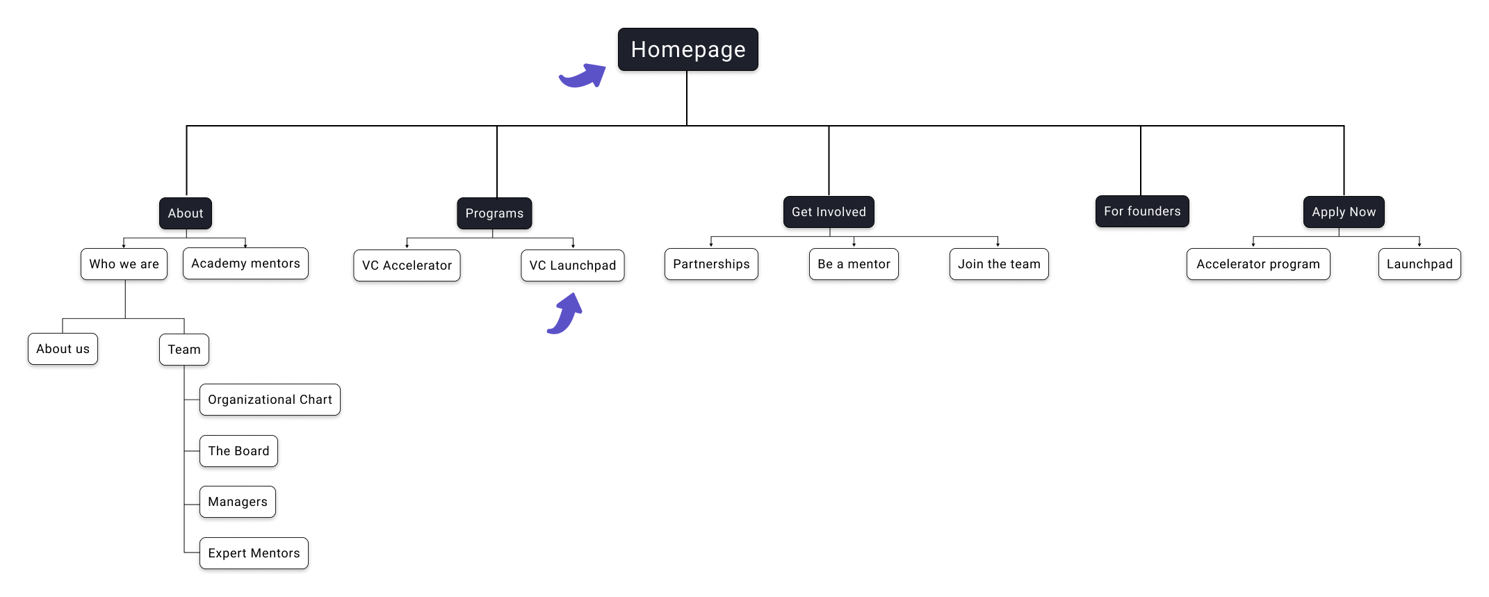
Next, I structured the following sections of the website as though I was a potential venture fellow considering signing up for IVA's programs. What would I want to find out at each stage of the journey / experience?
The three key questions identified were:
- Who is this program for? Is this the right program for me?
- What are the benefits of the program? What will I learn?
- What next? Going forward, how can I leverage my learnings in propelling my career or interest in early-stage venture financing?
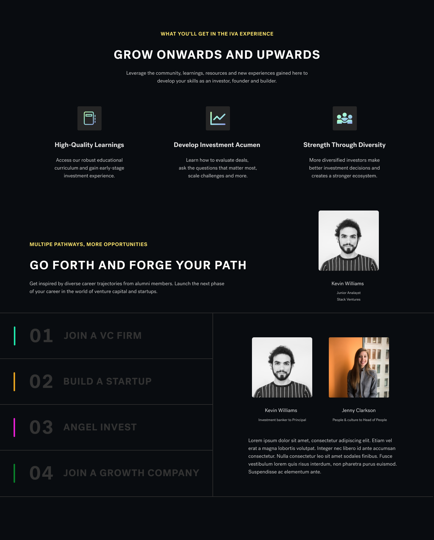
To answer the above questions, I designed the narrative of the website by highlighting the core target audience of the programs (e.g. founders, aspiring investors etc.), the key tangible outcomes of the programs, and finally the exit pathways available to them post-program (e.g. join a venture capital firm, angel invest etc.)
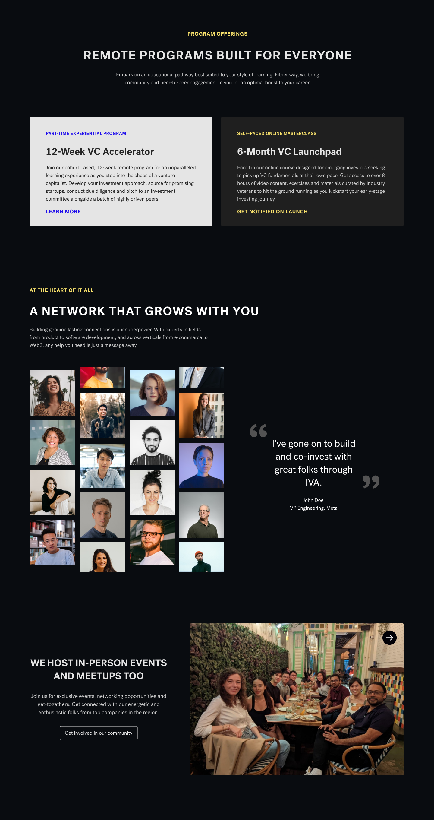
The final sections of the landing page were designed to showcase some of IVA's venture fellows and the strength of the IVA community, including networking events and meetups etc. A community feature section was also included to promote venture fellows' works as thought leaders in their respective industries.
In addition, I coordinated the building of the redesigned landing page with the product team, including copywriting and QA testing to ensure that the website was responsive and working as it should.

Program overview
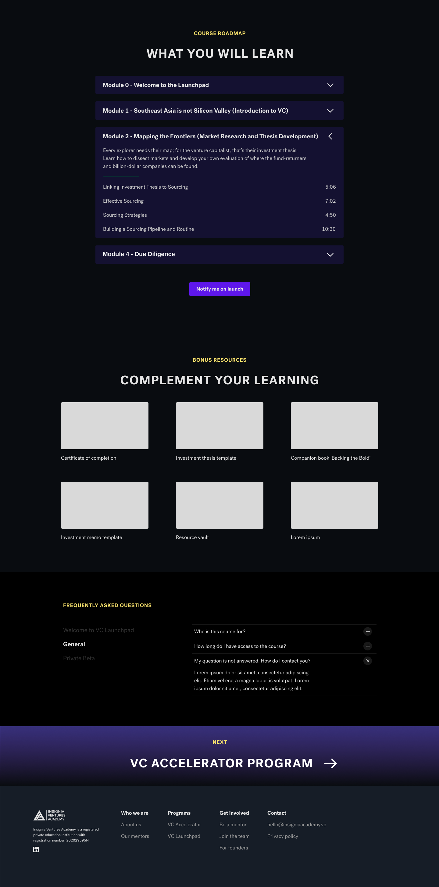
Program curriculum & FAQ
For the on-demand program, the intention was to hold a private beta phase to gather user feedback on the course content and platform on which it was hosted. Therefore, the key objective was to showcase the course curriculum and details, as well as gather interest for the private beta and eventual public launch.
It was intended for the page to be updated post private beta with more details such as course prices, testimonials and a list acknowledging the beta testers who contributed to the development of the on-demand program.
.png)
Error state for empty input fields 1
.png)
Success message (Interest in private beta)
.png)
Error state for empty input fields 2
.png)
Success message (Public launch notification)
For the sign-up forms for the private beta and public launch, I also designed the various success, error and focused states to properly guide and signal users on the progress of their form submissions.
> 200
unique sign-ups for the on-demand program
Increase
in number of leads generated and engagement
Through this project, I fully appreciated the importance of planning ahead to determine the content structure and copy prior to focusing on the design. Framing design decisions around content (e.g website layout, interactions) is a much more efficient approach. And part of the content also involves obtaining and consolidating the design assets to be used; pictures, illustrations, graphics, links, icons etc.
Having had no prior experience on the Agile and Scrum methodologies, this experience taught me to identify and prioritize design decisions / changes to be developed. To ensure optimal use of the developers' time, I learnt to withhold minor design changes that would not make a significant impact on the website. In addition, I gained an appreciation for the trade-offs between design and development; that there are times when a workaround is needed as the intended design is unable to be developed due to technical limitations (or inefficient codes).
